Main Viewport
Basic setup
As our application will grow in this tutorial with new UI elements, we already prepare the rough structure according to the final solution.
<Window
    x:Class="AlphaTabTutorial.MainWindow"
    xmlns="http://schemas.microsoft.com/winfx/2006/xaml/presentation"
    xmlns:x="http://schemas.microsoft.com/winfx/2006/xaml"
    xmlns:d="http://schemas.microsoft.com/expression/blend/2008"
    xmlns:local="clr-namespace:AlphaTabTutorial"
    xmlns:mc="http://schemas.openxmlformats.org/markup-compatibility/2006"
    Title="MainWindow"
    Width="800"
    Height="450"
    d:DataContext="{d:DesignInstance local:MainWindow}"
    mc:Ignorable="d">
    <Grid>
        <Grid.RowDefinitions>
            <RowDefinition Height="*" />
            <RowDefinition Height="Auto" />
        </Grid.RowDefinitions>

        <Canvas>
            <Border
                Canvas.Left="0"
                Canvas.Top="0"
                Width="{Binding RelativeSource={RelativeSource AncestorType=Canvas}, Path=ActualWidth}"
                Height="{Binding RelativeSource={RelativeSource AncestorType=Canvas}, Path=ActualHeight}"
                Padding="70,0,0,0">
                <TextBlock>Viewport</TextBlock>
            </Border>

            <Border
                Canvas.Left="0"
                Canvas.Top="0"
                Height="{Binding RelativeSource={RelativeSource AncestorType=Canvas}, Path=ActualHeight}"
                MinWidth="70"
                VerticalAlignment="Stretch"
                Background="#f7f7f7"
                BorderBrush="#1f000000"
                BorderThickness="0,0,1,0"
                ClipToBounds="False">
                <TextBlock>Tracks</TextBlock>
            </Border>
        </Canvas>

        <Grid
            Grid.Row="1"
            Grid.Column="0"
            Background="#436d9d">
            <TextBlock>Controls</TextBlock>
        </Grid>
    </Grid>
</Window>
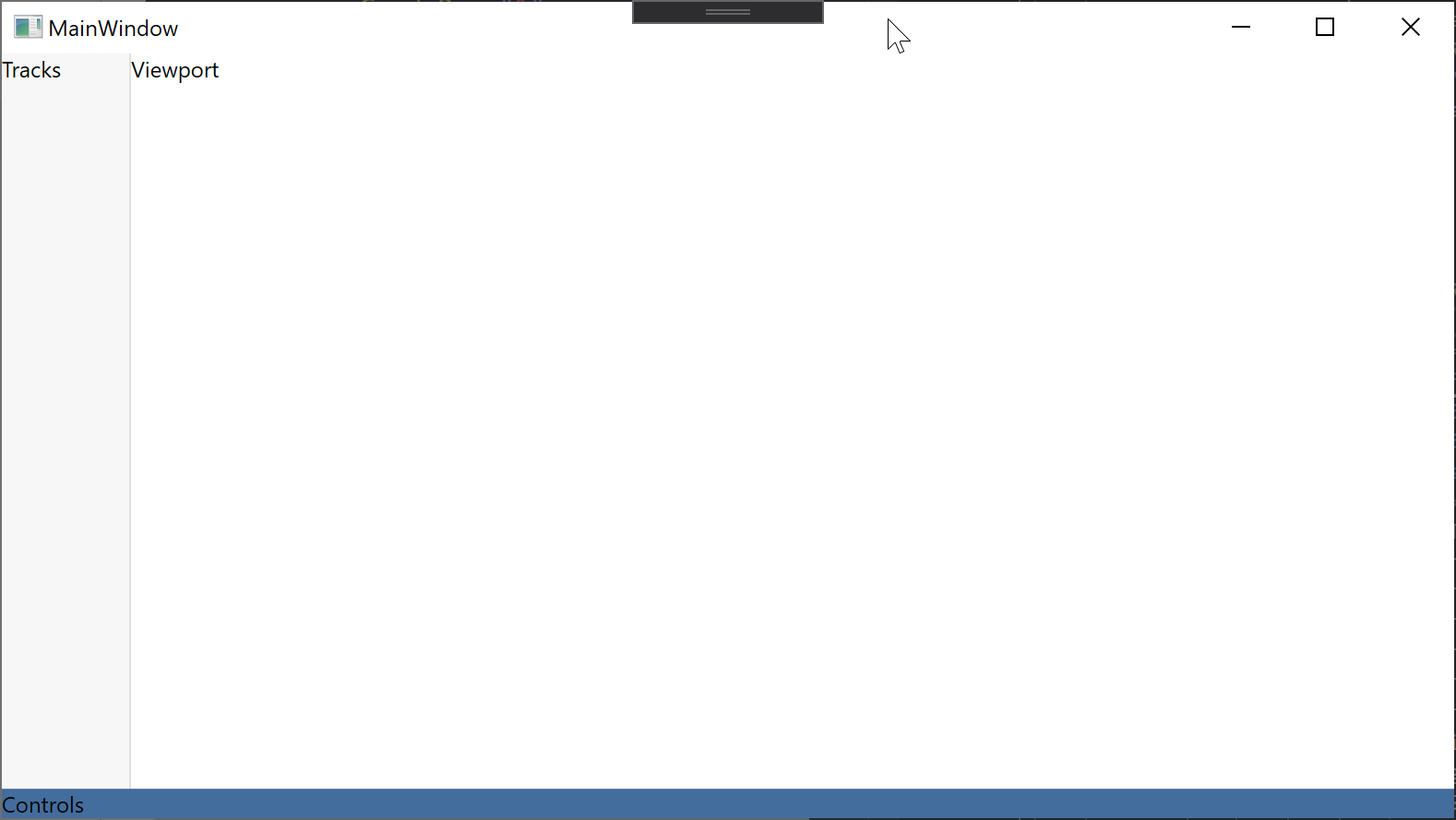
You can already see a bit the structure of the control. This step is not really specific to alphaTab but important to understand from a structural perspective. We are building a layout with a sidebar, main viewport and a footer. This structure is put together with a combination of flexbox and absolute positioning. CSS grid might be more suitable here but for better browser support we stick to these technologies.
The absolute positioning via canvas in the content will allow us later to build a sidebar that expands dynamically as an overlay to the music sheet.
For your project your development and design skills will be be needed to structure the elements right.
From now on the tutorial might only list small code snippets depending on the changes added to the component. The final file with all changes applied, will be added at the bottom of each tutorial section.
The result looks like this:
Initialize alphaTab
Now let's finally bring alphaTab into the game. We add an alphaTab control to the viewport and give it a name so we can access it in the code-behind. Then we will allow the user to choose a file from his file system that should be opened.
- New XAML
- New C#
On the viewport we add the main alphaTab WPF control. On the control toolbar we add some left-right separation for controls and on the left-side controls we add an open button.
<!-- xmlns:wpf="clr-namespace:AlphaTab.Wpf;assembly=AlphaTab.Windows" -->
<Border
    Canvas.Left="0"
    Canvas.Top="0"
    Width="{Binding RelativeSource={RelativeSource AncestorType=Canvas}, Path=ActualWidth}"
    Height="{Binding RelativeSource={RelativeSource AncestorType=Canvas}, Path=ActualHeight}"
    Padding="70,0,0,0">
    <wpf:AlphaTab x:Name="AlphaTab" />
</Border>
...

<Grid
    Grid.Row="1"
    Grid.Column="0"
    Background="#436d9d">
    <Grid.ColumnDefinitions>
        <ColumnDefinition Width="*" />
        <ColumnDefinition Width="*" />
    </Grid.ColumnDefinitions>

    <StackPanel
        Grid.Row="0"
        Grid.Column="0"
        Orientation="Horizontal">
        <Button Click="OnOpenClick">
            <fa:IconBlock Icon="FolderOpen" />
        </Button>
    </StackPanel>

    <StackPanel
        Grid.Row="0"
        Grid.Column="1"
        HorizontalAlignment="Right"
        Orientation="Horizontal" />
</Grid>
First we implement the INotifyPropertyChanged to utilize some WPF binding features.
Then we add some properties for the currently opened score and displayed track and hook them up accordingly.
On the button click event we show a file selector and fill in the loaded Score.
We use the ScoreLoader to load a score from the file.
using System;
using System.ComponentModel;
using System.IO;
using System.Runtime.CompilerServices;
using System.Windows;
using AlphaTab.Importer;
using AlphaTab.Model;
using Microsoft.Win32;

namespace AlphaTabTutorial
{
    public partial class MainWindow : INotifyPropertyChanged
    {
        private Score _score;
        private Track _selectedTrack;

        public Score Score
        {
            get => _score;
            set
            {
                if (Equals(value, _score)) return;
                _score = value;
                OnPropertyChanged();
                SelectedTrack = _score.Tracks[0];
            }
        }
        public Track SelectedTrack
        {
            get => _selectedTrack;
            set
            {
                if (Equals(value, _selectedTrack)) return;
                _selectedTrack = value;
                OnPropertyChanged();
                AlphaTab.Tracks = new[]
                {
                    value
                };
                AlphaTab.RenderTracks();
            }
        }

        public Viewport2()
        {
            InitializeComponent();
        }

        private void OnOpenClick(object sender, RoutedEventArgs e)
        {
            var dialog = new OpenFileDialog
            {
                Filter = "Supported Files (*.gp3, *.gp4, *.gp5, *.gpx, *.gp)|*.gp3;*.gp4;*.gp5;*.gpx;*.gp"
            };
            if (dialog.ShowDialog().GetValueOrDefault())
            {
                OpenFile(dialog.FileName);
            }
        }

        private void OpenFile(string fileName)
        {
            try
            {
                Score = ScoreLoader.LoadScoreFromBytes(File.ReadAllBytes(fileName));
            }
            catch (Exception e)
            {
                MessageBox.Show("Failed to open file: " + e.Message);
            }
        }

        public event PropertyChangedEventHandler PropertyChanged;
        protected virtual void OnPropertyChanged([CallerMemberName] string propertyName = null)
        {
            PropertyChanged?.Invoke(this, new PropertyChangedEventArgs(propertyName));
        }
    }
}
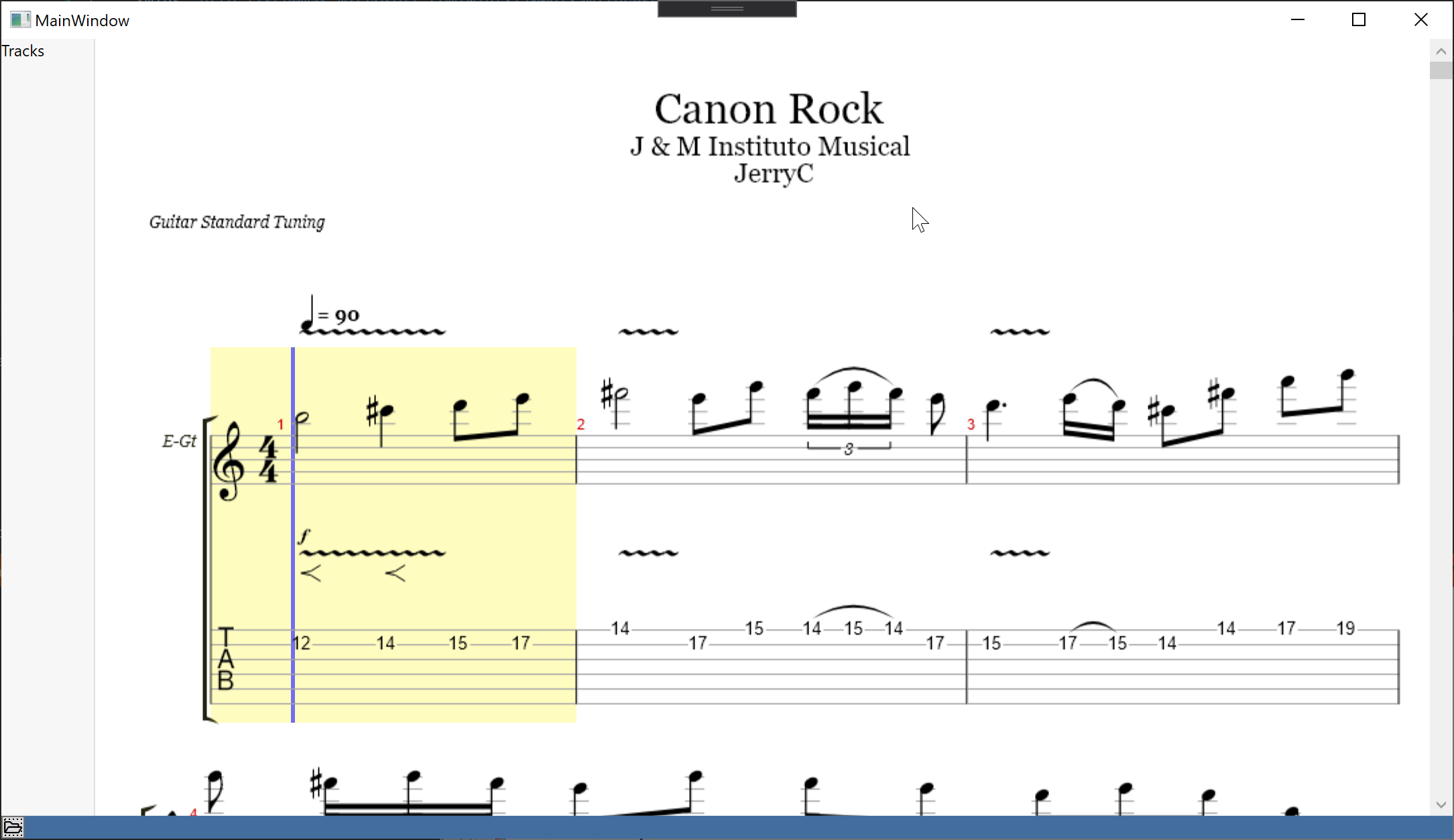
The result is already able to show some music sheet after selecting a file:
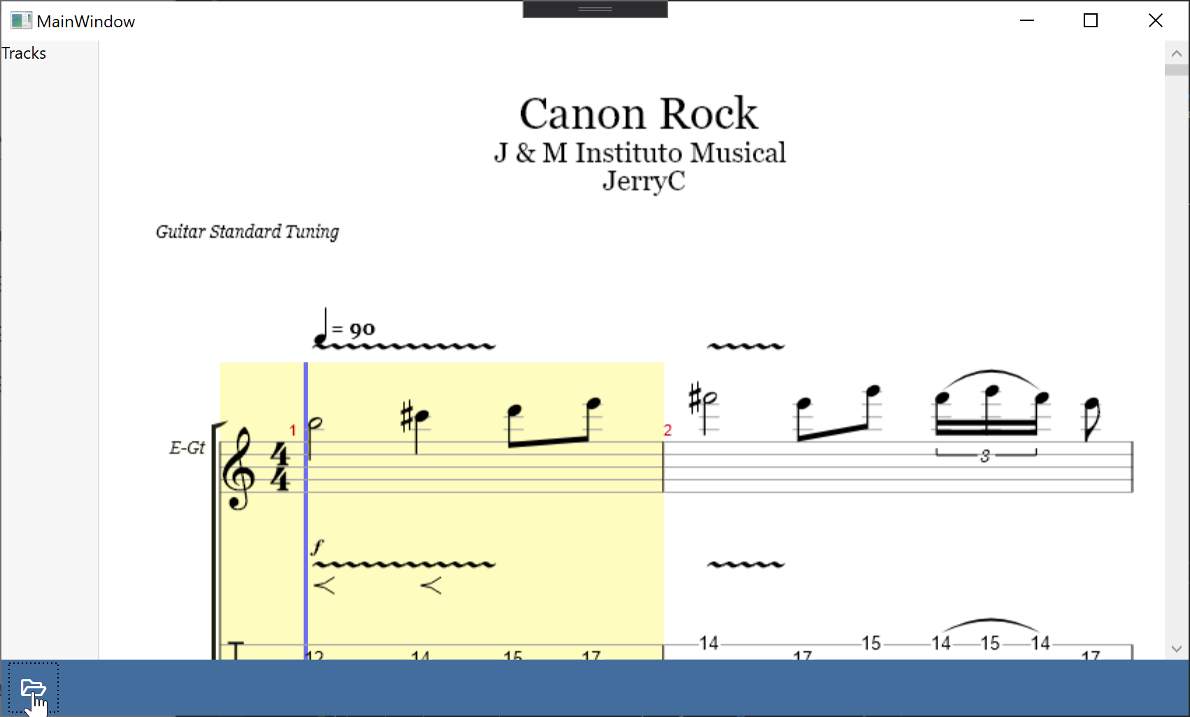
The button doesn't look very nice yet. So we add some styles. We just set some backgrounds, foregrounds to colorize the buttons and icons.
<Grid
    Grid.Row="1"
    Grid.Column="0"
    Background="#436d9d">
    <Grid.Resources>
        <Style x:Key="ToolbarButtonBaseStyle" TargetType="ButtonBase">
            <Setter Property="BorderThickness" Value="0" />
            <Setter Property="Background" Value="Transparent" />
            <Setter Property="Foreground" Value="White" />
            <Setter Property="FontSize" Value="16px" />
            <Setter Property="Padding" Value="4" />
            <Setter Property="Margin" Value="3,0" />
            <Setter Property="Width" Value="40" />
            <Setter Property="Height" Value="40" />
            <Setter Property="Cursor" Value="{x:Static Cursors.Hand}" />
            <Setter Property="Template">
                <Setter.Value>
                    <ControlTemplate TargetType="{x:Type ButtonBase}">
                        <Border
                            Name="Chrome"
                            Background="{TemplateBinding Background}"
                            BorderBrush="{TemplateBinding BorderBrush}"
                            SnapsToDevicePixels="true">
                            <ContentPresenter
                                Margin="{TemplateBinding Padding}"
                                HorizontalAlignment="{TemplateBinding HorizontalContentAlignment}"
                                VerticalAlignment="{TemplateBinding VerticalContentAlignment}"
                                RecognizesAccessKey="True"
                                SnapsToDevicePixels="{TemplateBinding SnapsToDevicePixels}" />
                        </Border>
                    </ControlTemplate>
                </Setter.Value>
            </Setter>
        </Style>
        <Style BasedOn="{StaticResource ToolbarButtonBaseStyle}" TargetType="Button" />
        <Style BasedOn="{StaticResource ToolbarButtonBaseStyle}" TargetType="ToggleButton">
            <Style.Triggers>
                <Trigger Property="IsChecked" Value="True">
                    <Setter Property="Background" Value="#5588c7" />
                </Trigger>
            </Style.Triggers>
        </Style>
        <Style TargetType="TextBlock">
            <Setter Property="Foreground" Value="White" />
            <Setter Property="Margin" Value="3,0" />
            <Setter Property="VerticalAlignment" Value="Center" />
        </Style>
        <Style TargetType="fa:IconBlock">
            <Setter Property="Foreground" Value="White" />
            <Setter Property="Margin" Value="3,0" />
            <Setter Property="VerticalAlignment" Value="Center" />
        </Style>
    </Grid.Resources>
As you can see so far, there are not much specific things to alphaTab to know beside the interaction with the alphaTab control and APIs. Many things are normal C#/WPF development tasks that you just have to plan and execute based on the application you're going to build.
Loading indicator
Depending on the size of the music sheet it might take a while until the file is loaded and rendered. We want to show a loading indicator until this is the case. This way the user will visually see that the file is being loaded and rendered.
To do this we will first extend the XAML with an overlay that we will dynamically show/hide depending on some alphaTab events.
- New XAML
- New C#
First we hook up to the loaded event of alphaTab. This is a very important: The alphaTab API is only accessible once the control loaded. If we try to access the API object before the alphaTab control is loaded it will be null.
Then we also add a new element to the main grid which will be our loading indicator. We bind it to a LoadingIndicatorVisibility property
to dynamically show/hide it.
<Window>
...
        <wpf:AlphaTab x:Name="AlphaTab" Loaded="OnAlphaTabLoaded" />
...
        <Grid
            Grid.Row="0"
            Grid.RowSpan="2"
            Visibility="{Binding LoadingIndicatorVisibility}">
            <Border Background="#80000000" />
            <Border
                Margin="0,20,0,0"
                Padding="10"
                HorizontalAlignment="Center"
                VerticalAlignment="Top"
                Background="White">
                <Border.Effect>
                    <DropShadowEffect
                        BlurRadius="10"
                        Direction="-90"
                        Opacity="0.3" />
                </Border.Effect>
                <TextBlock>
                    Music sheet is loading
                </TextBlock>
            </Border>
        </Grid>
    </Grid>
</Window>
We add a new property LoadingIndicatorVisibility with change notification which we bind to from the XAML.
In the constructor we setup the data context and initialize the indiactor to be hidden to allow opening a file.
In the OnAlphaTabLoaded we register to the required events to show/hide the indicator dynamically.
RenderStarted will tell us when the rendering of the music sheet started.
RenderFinished will tell us when the rendering of the music sheet finished.
private Visibility _loadingIndicatorVisibility = Visibility.Collapsed;
public Visibility LoadingIndicatorVisibility
{
    get => _loadingIndicatorVisibility;
    set
    {
        if (value == _loadingIndicatorVisibility) return;
        _loadingIndicatorVisibility = value;
        OnPropertyChanged();
    }
}

public MainWindow()
{
    InitializeComponent();
    DataContext = this;
}

private void OnAlphaTabLoaded(object sender, RoutedEventArgs e)
{
    AlphaTab.Api.RenderStarted.On(e =>
    {
        LoadingIndicatorVisibility = Visibility.Visible;
    });

    AlphaTab.Api.RenderFinished.On(e =>
    {
        LoadingIndicatorVisibility = Visibility.Collapsed;
    });
}
Final Files
- MainWindow.xaml
- MainWindow.xaml.cs
<Window
    x:Class="AlphaTabTutorial.MainWindow"
    xmlns="http://schemas.microsoft.com/winfx/2006/xaml/presentation"
    xmlns:x="http://schemas.microsoft.com/winfx/2006/xaml"
    xmlns:d="http://schemas.microsoft.com/expression/blend/2008"
    xmlns:fa="http://schemas.awesome.incremented/wpf/xaml/fontawesome.sharp"
    xmlns:local="clr-namespace:AlphaTabTutorial"
    xmlns:mc="http://schemas.openxmlformats.org/markup-compatibility/2006"
    xmlns:wpf="clr-namespace:AlphaTab.Wpf;assembly=AlphaTab.Windows"
    Title="MainWindow"
    Width="800"
    Height="450"
    d:DataContext="{d:DesignInstance local:MainWindow}"
    mc:Ignorable="d">
    <Grid>
        <Grid.RowDefinitions>
            <RowDefinition Height="*" />
            <RowDefinition Height="Auto" />
        </Grid.RowDefinitions>

        <Canvas>
            <Border
                Canvas.Left="0"
                Canvas.Top="0"
                Width="{Binding RelativeSource={RelativeSource AncestorType=Canvas}, Path=ActualWidth}"
                Height="{Binding RelativeSource={RelativeSource AncestorType=Canvas}, Path=ActualHeight}"
                Padding="70,0,0,0">
                <wpf:AlphaTab x:Name="AlphaTab" Loaded="OnAlphaTabLoaded" />
            </Border>

            <Border
                Canvas.Left="0"
                Canvas.Top="0"
                Height="{Binding RelativeSource={RelativeSource AncestorType=Canvas}, Path=ActualHeight}"
                MinWidth="70"
                VerticalAlignment="Stretch"
                Background="#f7f7f7"
                BorderBrush="#1f000000"
                BorderThickness="0,0,1,0"
                ClipToBounds="False">
                <TextBlock>Tracks</TextBlock>
            </Border>
        </Canvas>

        <Grid
            Grid.Row="1"
            Grid.Column="0"
            Background="#436d9d">
            <Grid.Resources>
                <Style x:Key="ToolbarButtonBaseStyle" TargetType="ButtonBase">
                    <Setter Property="BorderThickness" Value="0" />
                    <Setter Property="Background" Value="Transparent" />
                    <Setter Property="Foreground" Value="White" />
                    <Setter Property="FontSize" Value="16px" />
                    <Setter Property="Padding" Value="4" />
                    <Setter Property="Margin" Value="3,0" />
                    <Setter Property="Width" Value="40" />
                    <Setter Property="Height" Value="40" />
                    <Setter Property="Cursor" Value="{x:Static Cursors.Hand}" />
                    <Setter Property="Template">
                        <Setter.Value>
                            <ControlTemplate TargetType="{x:Type ButtonBase}">
                                <Border
                                    Name="Chrome"
                                    Background="{TemplateBinding Background}"
                                    BorderBrush="{TemplateBinding BorderBrush}"
                                    SnapsToDevicePixels="true">
                                    <ContentPresenter
                                        Margin="{TemplateBinding Padding}"
                                        HorizontalAlignment="{TemplateBinding HorizontalContentAlignment}"
                                        VerticalAlignment="{TemplateBinding VerticalContentAlignment}"
                                        RecognizesAccessKey="True"
                                        SnapsToDevicePixels="{TemplateBinding SnapsToDevicePixels}" />
                                </Border>
                            </ControlTemplate>
                        </Setter.Value>
                    </Setter>
                </Style>
                <Style BasedOn="{StaticResource ToolbarButtonBaseStyle}" TargetType="Button" />
                <Style BasedOn="{StaticResource ToolbarButtonBaseStyle}" TargetType="ToggleButton">
                    <Style.Triggers>
                        <Trigger Property="IsChecked" Value="True">
                            <Setter Property="Background" Value="#5588c7" />
                        </Trigger>
                    </Style.Triggers>
                </Style>
                <Style TargetType="TextBlock">
                    <Setter Property="Foreground" Value="White" />
                    <Setter Property="Margin" Value="3,0" />
                    <Setter Property="VerticalAlignment" Value="Center" />
                </Style>
                <Style TargetType="fa:IconBlock">
                    <Setter Property="Foreground" Value="White" />
                    <Setter Property="Margin" Value="3,0" />
                    <Setter Property="VerticalAlignment" Value="Center" />
                </Style>
            </Grid.Resources>

            <Grid.ColumnDefinitions>
                <ColumnDefinition Width="*" />
                <ColumnDefinition Width="*" />
            </Grid.ColumnDefinitions>

            <StackPanel
                Grid.Row="0"
                Grid.Column="0"
                Orientation="Horizontal">
                <Button Click="OnOpenClick">
                    <fa:IconBlock Icon="FolderOpen" />
                </Button>
            </StackPanel>

            <StackPanel
                Grid.Row="0"
                Grid.Column="1"
                HorizontalAlignment="Right"
                Orientation="Horizontal" />
        </Grid>

        <Grid
            Grid.Row="0"
            Grid.RowSpan="2"
            Visibility="{Binding LoadingIndicatorVisibility}">
            <Border Background="#80000000" />
            <Border
                Margin="0,20,0,0"
                Padding="10"
                HorizontalAlignment="Center"
                VerticalAlignment="Top"
                Background="White">
                <Border.Effect>
                    <DropShadowEffect
                        BlurRadius="10"
                        Direction="-90"
                        Opacity="0.3" />
                </Border.Effect>
                <TextBlock>
                    Music sheet is loading
                </TextBlock>
            </Border>
        </Grid>
    </Grid>
</Window>
using System;
using System.ComponentModel;
using System.IO;
using System.Runtime.CompilerServices;
using System.Windows;
using AlphaTab.Importer;
using AlphaTab.Model;
using Microsoft.Win32;

namespace AlphaTabTutorial
{
    public partial class MainWindow : INotifyPropertyChanged
    {
        private Score _score;
        private Track _selectedTrack;

        public Score Score
        {
            get => _score;
            set
            {
                if (Equals(value, _score)) return;
                _score = value;
                OnPropertyChanged();
                SelectedTrack = _score.Tracks[0];
            }
        }
        public Track SelectedTrack
        {
            get => _selectedTrack;
            set
            {
                if (Equals(value, _selectedTrack)) return;
                _selectedTrack = value;
                OnPropertyChanged();
                AlphaTab.Tracks = new[]
                {
                    value
                };
                AlphaTab.RenderTracks();
            }
        }

        private Visibility _loadingIndicatorVisibility = Visibility.Collapsed;
        public Visibility LoadingIndicatorVisibility
        {
            get => _loadingIndicatorVisibility;
            set
            {
                if (value == _loadingIndicatorVisibility) return;
                _loadingIndicatorVisibility = value;
                OnPropertyChanged();
            }
        }

        public MainWindow()
        {
            InitializeComponent();
            DataContext = this;
        }

        private void OnAlphaTabLoaded(object sender, RoutedEventArgs e)
        {
            AlphaTab.Api.RenderStarted.On(e =>
            {
                LoadingIndicatorVisibility = Visibility.Visible;
            });

            AlphaTab.Api.RenderFinished.On(e =>
            {
                LoadingIndicatorVisibility = Visibility.Collapsed;
            });
        }

        private void OnOpenClick(object sender, RoutedEventArgs e)
        {
            var dialog = new OpenFileDialog
            {
                Filter = "Supported Files (*.gp3, *.gp4, *.gp5, *.gpx, *.gp)|*.gp3;*.gp4;*.gp5;*.gpx;*.gp"
            };
            if (dialog.ShowDialog().GetValueOrDefault())
            {
                OpenFile(dialog.FileName);
            }
        }

        private void OpenFile(string fileName)
        {
            try
            {
                Score = ScoreLoader.LoadScoreFromBytes(File.ReadAllBytes(fileName));
            }
            catch (Exception e)
            {
                MessageBox.Show("Failed to open file: " + e.Message);
            }
        }

        public event PropertyChangedEventHandler PropertyChanged;
        protected virtual void OnPropertyChanged([CallerMemberName] string propertyName = null)
        {
            PropertyChanged?.Invoke(this, new PropertyChangedEventArgs(propertyName));
        }
    }
}