Track Selector
Build the track selector
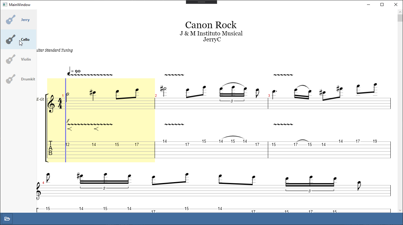
In many files that alphaTab supports, there might be more than just one instrument contained. There can be vocals, guitars, drums or other instruments where the notation is available. Users would like to switch between the individual tracks.
The track selector will go into the sidebar, so we will add a new ListBox with some styles. The ListBox we will bind to to some of our existing properties.
<Border
    Canvas.Left="0"
    Canvas.Top="0"
    Height="{Binding RelativeSource={RelativeSource AncestorType=Canvas}, Path=ActualHeight}"
    MinWidth="70"
    VerticalAlignment="Stretch"
    Background="#f7f7f7"
    BorderBrush="#1f000000"
    BorderThickness="0,0,1,0"
    ClipToBounds="False">
    <Border.Resources>
        <Style TargetType="ListBox">
            <Setter Property="SelectionMode" Value="Single" />
            <Setter Property="Background" Value="Transparent" />
            <Setter Property="BorderThickness" Value="0" />
            <Setter Property="Padding" Value="0" />
            <Setter Property="MinWidth" Value="70" />
            <Setter Property="ScrollViewer.HorizontalScrollBarVisibility" Value="Hidden" />
            <Style.Triggers>
                <Trigger Property="IsMouseOver" Value="False">
                    <Setter Property="MaxWidth" Value="70" />
                </Trigger>
            </Style.Triggers>
        </Style>
        <Style TargetType="ListBoxItem">
            <Setter Property="Background" Value="Transparent" />
            <Setter Property="BorderThickness" Value="0" />
            <Setter Property="Margin" Value="0" />
            <Style.Triggers>
                <Trigger Property="IsSelected" Value="True">
                    <Setter Property="Background" Value="#08000000" />
                    <Setter Property="fa:IconBlock.Foreground" Value="#4972a1" />
                    <Setter Property="fa:IconBlock.Opacity" Value="1" />
                </Trigger>
                <Trigger Property="IsSelected" Value="False">
                    <Setter Property="fa:IconBlock.Opacity" Value="0.5" />
                </Trigger>
                <Trigger Property="IsMouseOver" Value="True">
                    <Setter Property="Background" Value="#1a000000" />
                    <Setter Property="fa:IconBlock.Opacity" Value="1" />
                </Trigger>
            </Style.Triggers>
        </Style>
    </Border.Resources>
    <ListBox ItemsSource="{Binding Score.Tracks}" SelectedItem="{Binding SelectedTrack}">
        <ListBox.ItemTemplate>
            <ItemContainerTemplate DataType="model:Track">
                <Grid Height="64">
                    <Grid.ColumnDefinitions>
                        <ColumnDefinition Width="64" />
                        <ColumnDefinition Width="*" />
                    </Grid.ColumnDefinitions>

                    <fa:IconBlock
                        Grid.Column="0"
                        Margin="0,0,5,0"
                        HorizontalAlignment="Center"
                        VerticalAlignment="Center"
                        FontSize="32px"
                        Icon="Guitar"
                        Opacity="0.5" />

                    <TextBlock
                        Grid.Column="1"
                        VerticalAlignment="Center"
                        FontWeight="Bold"
                        Text="{Binding Name}" />
                </Grid>
            </ItemContainerTemplate>
        </ListBox.ItemTemplate>
    </ListBox>
</Border>
We bind to the Score.Tracks for the ItemsSource to show all tracks of the current score, the SelectedItem binding will make the ListBox
interactive to update the currently shown track upons user inteaction. Most of the code is just for styling.
Final File
<Window
    x:Class="AlphaTabTutorial.MainWindow"
    xmlns="http://schemas.microsoft.com/winfx/2006/xaml/presentation"
    xmlns:x="http://schemas.microsoft.com/winfx/2006/xaml"
    xmlns:d="http://schemas.microsoft.com/expression/blend/2008"
    xmlns:fa="http://schemas.awesome.incremented/wpf/xaml/fontawesome.sharp"
    xmlns:local="clr-namespace:AlphaTabTutorial"
    xmlns:mc="http://schemas.openxmlformats.org/markup-compatibility/2006"
    xmlns:wpf="clr-namespace:AlphaTab.Wpf;assembly=AlphaTab.Windows"
    Title="MainWindow"
    Width="800"
    Height="450"
    d:DataContext="{d:DesignInstance local:MainWindow}"
    mc:Ignorable="d">
    <Grid>
        <Grid.RowDefinitions>
            <RowDefinition Height="*" />
            <RowDefinition Height="Auto" />
        </Grid.RowDefinitions>

        <Canvas>
            <Border
                Canvas.Left="0"
                Canvas.Top="0"
                Width="{Binding RelativeSource={RelativeSource AncestorType=Canvas}, Path=ActualWidth}"
                Height="{Binding RelativeSource={RelativeSource AncestorType=Canvas}, Path=ActualHeight}"
                Padding="70,0,0,0">
                <wpf:AlphaTab x:Name="AlphaTab" Loaded="OnAlphaTabLoaded" />
            </Border>

            <Border
                Canvas.Left="0"
                Canvas.Top="0"
                Height="{Binding RelativeSource={RelativeSource AncestorType=Canvas}, Path=ActualHeight}"
                MinWidth="70"
                VerticalAlignment="Stretch"
                Background="#f7f7f7"
                BorderBrush="#1f000000"
                BorderThickness="0,0,1,0"
                ClipToBounds="False">
                <Border.Resources>
                    <Style TargetType="ListBox">
                        <Setter Property="SelectionMode" Value="Single" />
                        <Setter Property="Background" Value="Transparent" />
                        <Setter Property="BorderThickness" Value="0" />
                        <Setter Property="Padding" Value="0" />
                        <Setter Property="MinWidth" Value="70" />
                        <Setter Property="ScrollViewer.HorizontalScrollBarVisibility" Value="Hidden" />
                        <Style.Triggers>
                            <Trigger Property="IsMouseOver" Value="False">
                                <Setter Property="MaxWidth" Value="70" />
                            </Trigger>
                        </Style.Triggers>
                    </Style>
                    <Style TargetType="ListBoxItem">
                        <Setter Property="Background" Value="Transparent" />
                        <Setter Property="BorderThickness" Value="0" />
                        <Setter Property="Margin" Value="0" />
                        <Style.Triggers>
                            <Trigger Property="IsSelected" Value="True">
                                <Setter Property="Background" Value="#08000000" />
                                <Setter Property="fa:IconBlock.Foreground" Value="#4972a1" />
                                <Setter Property="fa:IconBlock.Opacity" Value="1" />
                            </Trigger>
                            <Trigger Property="IsSelected" Value="False">
                                <Setter Property="fa:IconBlock.Opacity" Value="0.5" />
                            </Trigger>
                            <Trigger Property="IsMouseOver" Value="True">
                                <Setter Property="Background" Value="#1a000000" />
                                <Setter Property="fa:IconBlock.Opacity" Value="1" />
                            </Trigger>
                        </Style.Triggers>
                    </Style>
                </Border.Resources>
                <ListBox ItemsSource="{Binding Score.Tracks}" SelectedItem="{Binding SelectedTrack}">
                    <ListBox.ItemTemplate>
                        <ItemContainerTemplate DataType="model:Track">
                            <Grid Height="64">
                                <Grid.ColumnDefinitions>
                                    <ColumnDefinition Width="64" />
                                    <ColumnDefinition Width="*" />
                                </Grid.ColumnDefinitions>

                                <fa:IconBlock
                                    Grid.Column="0"
                                    Margin="0,0,5,0"
                                    HorizontalAlignment="Center"
                                    VerticalAlignment="Center"
                                    FontSize="32px"
                                    Icon="Guitar"
                                    Opacity="0.5" />

                                <TextBlock
                                    Grid.Column="1"
                                    VerticalAlignment="Center"
                                    FontWeight="Bold"
                                    Text="{Binding Name}" />
                            </Grid>
                        </ItemContainerTemplate>
                    </ListBox.ItemTemplate>
                </ListBox>
            </Border>
        </Canvas>

        <Grid
            Grid.Row="1"
            Grid.Column="0"
            Background="#436d9d">
            <Grid.Resources>
                <Style x:Key="ToolbarButtonBaseStyle" TargetType="ButtonBase">
                    <Setter Property="BorderThickness" Value="0" />
                    <Setter Property="Background" Value="Transparent" />
                    <Setter Property="Foreground" Value="White" />
                    <Setter Property="FontSize" Value="16px" />
                    <Setter Property="Padding" Value="4" />
                    <Setter Property="Margin" Value="3,0" />
                    <Setter Property="Width" Value="40" />
                    <Setter Property="Height" Value="40" />
                    <Setter Property="Cursor" Value="{x:Static Cursors.Hand}" />
                    <Setter Property="Template">
                        <Setter.Value>
                            <ControlTemplate TargetType="{x:Type ButtonBase}">
                                <Border
                                    Name="Chrome"
                                    Background="{TemplateBinding Background}"
                                    BorderBrush="{TemplateBinding BorderBrush}"
                                    SnapsToDevicePixels="true">
                                    <ContentPresenter
                                        Margin="{TemplateBinding Padding}"
                                        HorizontalAlignment="{TemplateBinding HorizontalContentAlignment}"
                                        VerticalAlignment="{TemplateBinding VerticalContentAlignment}"
                                        RecognizesAccessKey="True"
                                        SnapsToDevicePixels="{TemplateBinding SnapsToDevicePixels}" />
                                </Border>
                            </ControlTemplate>
                        </Setter.Value>
                    </Setter>
                </Style>
                <Style BasedOn="{StaticResource ToolbarButtonBaseStyle}" TargetType="Button" />
                <Style BasedOn="{StaticResource ToolbarButtonBaseStyle}" TargetType="ToggleButton">
                    <Style.Triggers>
                        <Trigger Property="IsChecked" Value="True">
                            <Setter Property="Background" Value="#5588c7" />
                        </Trigger>
                    </Style.Triggers>
                </Style>
                <Style TargetType="TextBlock">
                    <Setter Property="Foreground" Value="White" />
                    <Setter Property="Margin" Value="3,0" />
                    <Setter Property="VerticalAlignment" Value="Center" />
                </Style>
                <Style TargetType="fa:IconBlock">
                    <Setter Property="Foreground" Value="White" />
                    <Setter Property="Margin" Value="3,0" />
                    <Setter Property="VerticalAlignment" Value="Center" />
                </Style>
            </Grid.Resources>

            <Grid.ColumnDefinitions>
                <ColumnDefinition Width="*" />
                <ColumnDefinition Width="*" />
            </Grid.ColumnDefinitions>

            <StackPanel
                Grid.Row="0"
                Grid.Column="0"
                Orientation="Horizontal">
                <Button Click="OnOpenClick">
                    <fa:IconBlock Icon="FolderOpen" />
                </Button>
            </StackPanel>

            <StackPanel
                Grid.Row="0"
                Grid.Column="1"
                HorizontalAlignment="Right"
                Orientation="Horizontal" />
        </Grid>

        <Grid
            Grid.Row="0"
            Grid.RowSpan="2"
            Visibility="{Binding LoadingIndicatorVisibility}">
            <Border Background="#80000000" />
            <Border
                Margin="0,20,0,0"
                Padding="10"
                HorizontalAlignment="Center"
                VerticalAlignment="Top"
                Background="White">
                <Border.Effect>
                    <DropShadowEffect
                        BlurRadius="10"
                        Direction="-90"
                        Opacity="0.3" />
                </Border.Effect>
                <TextBlock>
                    Music sheet is loading
                </TextBlock>
            </Border>
        </Grid>
    </Grid>
</Window>